Click on images to see them in full screen
91335D9A0FC4040A80257D07006BBD75Special Customisation
With Door Tablet, you can perform special customisation of the displays. You can change:
- The graphics used as the Traffic Lights (using CSS)
- Facility icons (using CSS)
- Day names (using translation sets)
- Month names (using translation sets)
- Report subject names (using translation sets)
- Information icons
- Current meeting styling
- Fonts
- Timer donuts
- QR Code colors
- Schedule rows odd/even bars
- Language switching
- Button icons and check-in button
- Change the appearance of Switcher (see
 )
)
- Button sizes (using CSS)
From version 8.2.4 of the Door Tablet App you may customise the icons used in buttons and the special check-in button. See bottom of this page
VIDEO: Setting up key business rules
To learn how to work with CSS please see here
For changing floor plan colours including on BOOKER, see here
Note: from V10.0.11 you can install a style sheet but not load the Base CSS at all. This gives you complete freedom to set your own CSS without the need to reset the Base CSS first. To achieve this simply name your style sheet to include the following string "rem_". For example, your CSS file could be called "rem_Mystyles.css"
Windows Store App
If you are using the Door Tablet Windows Store App please note:
- Any reference to images must be absolute to the Door Tablet server. This means that your reference to images would look like so: "background-image: url(http://internal-dt-server.com/branding/logo.png);"
- Fonts cannot be added as described here but rather be embedded in the application, by us. This service is chargeable
Some examples
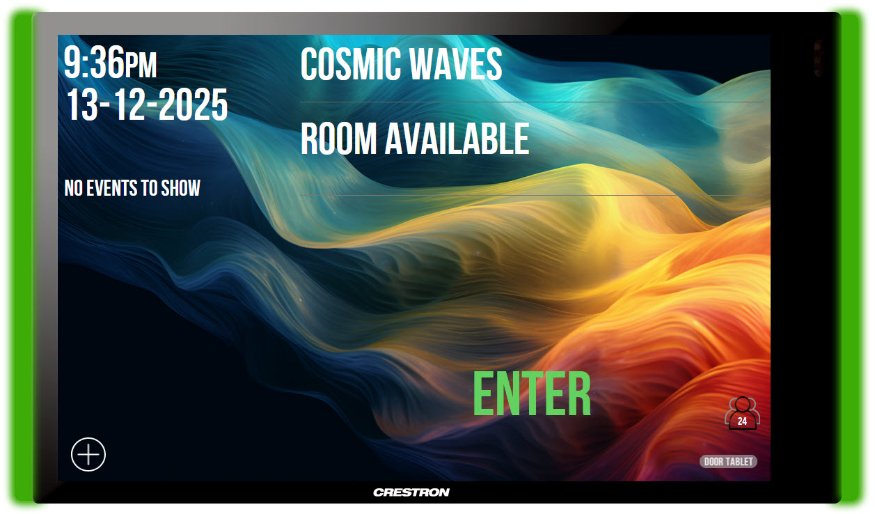
You can completely transform the Door Tablet display. This is the result of recent adaptation for a client and shows the usage of a single graphic to provide a metal look for the entire tablet background.
The adaptations may be performed on all Door Tablet displays including single meeting spaces and Wayfinding displays.

 Note:
Note: All the themes showing on the web site are available to download and adapt.
Adding a corporate logos
Due to a fault in the Android rendering engine, placing background images at the top right corner of the display is often problematic. We resolved this issue by adding two empty divs which you can use both in the meeting space and Cluster Displays. Use the following CSS in your own CSS and adjust as needed. As you can see below, the logo in the Cluster display will be placed a bit further to the left by setting its distance from the right edge to 160px;
#roomLogo, #clusterLogo {

	top:10px;

	background-image: url(logo.png);

	background-repeat: no-repeat;

	width:130px;

	height: 90px;

	right: 10px;

}

#clusterLogo {

	right: 160px;

}
Getting Busy
When your meeting space becomes busy, the top object in the display gets a "class" added to it. This allows you to change the style of any object in the display for when the meeting space becomes busy. For example, if you use the metallic background, when the meeting space becomes busy you can simply change the background to, say, a copper color pattern. This is achieved as follows:
#roomDisp.busy {

	background-image: url(copper.png);

}
OR
#roomDisp {

	background-image: url(/branding/background-free.jpg);

}

#roomDisp.busy {

	background-image: url(/branding/background-busy.jpg);

}
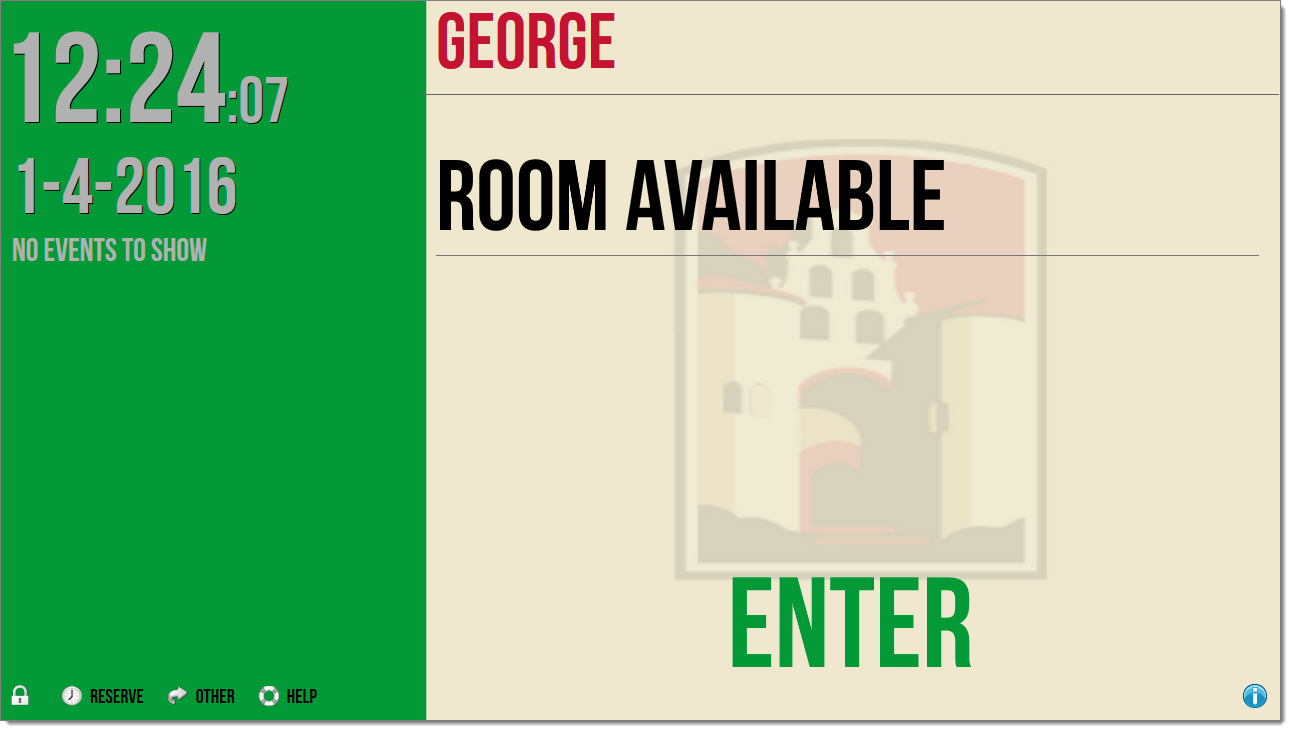
A free meeting space:
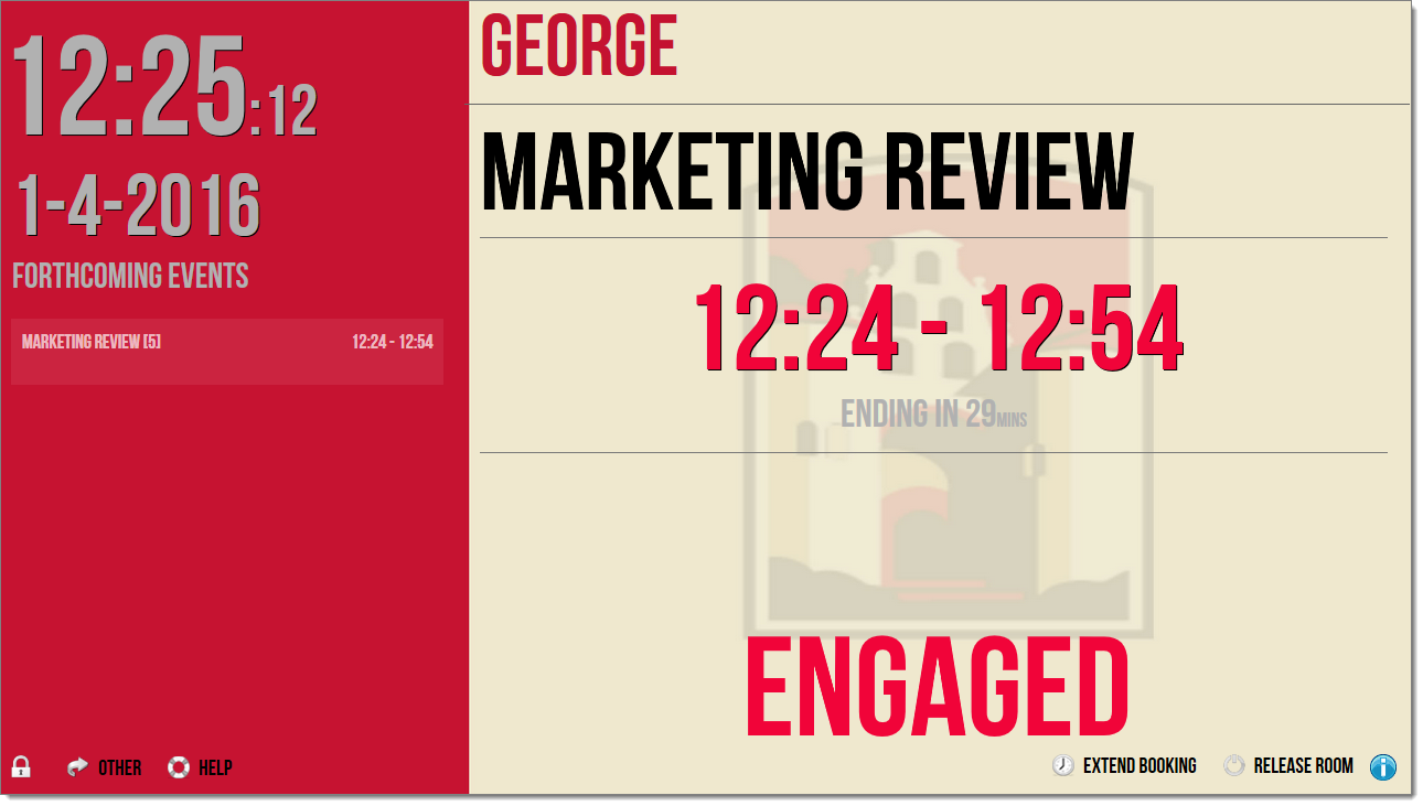
And now the meeting space is busy:
Three Statuses
From version 7.4 of the Door Tablet client we implement four statuses:
- Free
- Busy soon (a meeting in ten minutes)
- Busy
- Active (thanks to sensor support)
To implement the new status, use the class "busysoon". You may use the class for all elements of the screen.
#roomDisp {

	background-image: url('branding/free.jpg');

}

#roomDisp.busy {

	background-image: url('branding/busy.jpg');

}

#roomDisp.busysoon {

	background-image: url('branding/busysoon.jpg');

}

#roomDisp.active {

	background-image: url('branding/active.jpg');

}
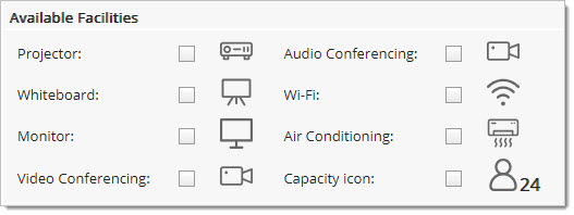
Facility icons
You can use your own facility icons by placing these on the Door Tablet server and referring to just one of them using the following ID:
#facility-icon
Note: you only specify one file in this CSS. Door Tablet will expect that all your icons are in the same location and are named as:
pr.gif
wb.gif
mo.gif
vc.gif
au.gif
wi.gif
ac.gif
ca.gif
map.gif
We use map.gif for a touch function that shows where a map or photo of a resource exists. Please ensure it's not too small.
Your CSS would look like this line:
#facility-icon {

	background-image: url(/doortablet/facilities/wb.gif);

}
Default facility icons used by Door Tablet:
Note: If you change the size of these icons from their original size of 41x26 you will also need to change the dimensions listed in the following styles:
#roomFacil .facilTblList {

	margin: 0 auto;

}

.facilTblList td{

	border: 0px;

	width:	42px;

	height: 30px;

}

.facilTblList tbody tr td{

	font-family: "HelveticaNeue-Roman", "Helvetica Neue", Helvetica,Arial,sans-serif;

	border: 0px;

	font-size:1.5em;

	line-height:1.5em;

	font-weight: bold;

}
Note: when displaying the capacity of a meeting space, Door Tablet uses the above style. You may need to adjust the style to fit into your icons.
Note for Windows Store Apps: you cannot add fonts using CSS in the method described here. Fonts have to be added to the Door Tablet Windows Store application, this is a chargeable service.
Day, Month and Report Subject Names
Door Tablet displays day and month names in an abbreviated format for each of the languages currently supported. You can change the names to long format and add your own language. You perform this customization using the Translation feature in the system. For more information about translations see here .
Days
To add day names, add an entry to your Translation Set using the following format:
daynames:<comma delimited list of days - 7 days must be listed starting with the equivalent of Sunday>
Example:
daynames:Sunday,Monday,Tuesday,Wednesday,Thursday,Friday,Saturday
Note: if you do not specify 7 names the setting will simply be ignored.
Months
To add month names, add an entry to your Translation Set using the following format:
monthnames:<comma delimited list of days - 12 months must be listed starting with the equivalent of January>
Example:
monthnames:January,February,March,April,May,June,July,August,September,October,November,December
Note: if you do not specify 12 names the setting will simply be ignored.
Report subject
To add report subject names, add an entry to your Translation Set using the following format:
reportnames:<comma delimited list of report subject names - 10 subjects must be listed in the same order as showing below>
Example:
reportnames:Catering,Cleanliness,Computer LAN,Furniture,Climate,Lights,Projector,Telephone,Conferencing,Drawing Board
Note: if you do not specify 10 subject names the setting will simply be ignored.
Information Icon
The information icon at the bottom right corner of the Door Tablet display may only be changed if you supply it to us, and we will embed the icons in the application. You will then be able to specify your icon at a global system level or on a meeting space basis. To supply us with these icons you must first be a paying customer. The files are of type "png" and 24x24 pixels. The files must also look different where one of them must be red in tone.
The standard Information Icons:

Current meeting styling
When Door Tablet displays meetings, a list of the upcoming meetings of the day appears below the clock. Actual meeting information appears below the meeting room name. When a meeting becomes current the entry in the meeting list is updated to contain the additional CSS class "current". Therefore, the combined class is "meetingBox current". You can add styling to this combined class and pain it in a different way compared to other meetings which are later on.
Fonts
There are few ways you can change fonts used by the Door Tablet display. One common method is using CSS3 @font-face. You can read about it here.
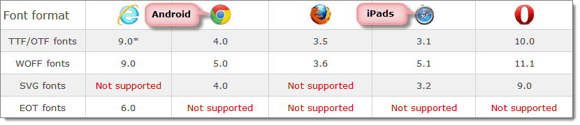
Steps
- Convert the fonts or obtain these in any one of these formats: eot, woff, ttf and svg. Depending on your Tablet or browser, not all formats are supported
- Place the files on the Door Tablet server under the HTML directory
- Define the font in CSS - see example below
Example for when using "Roboto Condensed" font:
@font-face {

    font-family: 'Roboto Condensed';

    src: url('/myCompantName/fonts/robotocondensed-webfont.eot');

    src: url('/myCompantName/fonts/robotocondensed-webfont.eot?#iefix') format('embedded-opentype'),

         url('/myCompantName/fonts/robotocondensed-webfont.woff') format('woff'),

         url('/myCompantName/fonts/robotocondensed-webfont.ttf') format('truetype'),

         url('/myCompantName/fonts/robotocondensed-webfont.svg#roboto_condensedbold') format('svg');

    font-weight: normal;

    font-style: normal;

}
Ready to use:
You are now able to refer to the new font name in the CSS overriding the standard fonts used by Door Tablet.
Additional branding
When you display a Schedule on a large monitor a few objects can be used by branding. These elements may be viewed using common methods for identifying CSS on a page. In addition, we inserted an empty <DIV> you can use to place graphics on and place this anywhere on your screen.
DIV IDs:
Schedule screens: brandingSc
Welcome screens: brandingWc
For example...
#brandingSc {

	position: absolute;

	top: 14px;

	right: 100px;

	height: 60px;

	width:160px;

	background-color:#006400;

	text-indent: right;

	display: block;

}
The above CSS results in the green box showing below:
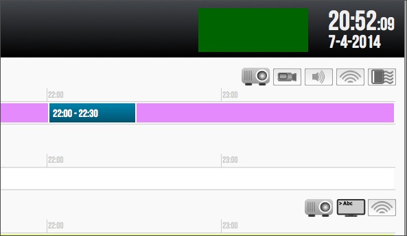
Timer Donuts
Timer donuts appear on all pop ups that will abort within a certain number of seconds. Change the following styles to control size and color of timer donuts.
.countDown { height: 20px; width:20px;}


#pie_bkg {

	/*donut starts with this image */

	background-image: url("../img/pie_bkg_small.png");

}

#pie_frg {

	/*donut ends with this image */

	background-image: url("../img/pie_frg_small.png");

}
QR Codes
These codes show when Door Tablet checks you in. You can change the color of the displayed code, as follows:
#qrcodes {

	color: #000;

}
Schedule Rows
When displaying schedules of other meeting spaces, and generally when time bars are shown in Wayfinding displays, we are wrapping each resource using a DIV. The DIVs have alternate classes allowing you to color odd and even bars differently. Two classes are attributed, allowing you to set common styles to both odd and even bars. The classes are:
Common class: .schedule_row
For odd lines: .odd
For even lines: .even
Language switching
When you use the Door Tablet language switching feature, you may wish the adjust the design according to language. When you touch a language, the Door Tablet code will allow you specify CSS based on that language translation set name. For example, if you specify a translation set and you call it, say, Arabic, when you switch to Arabic all the objects on the display can reference this condition by using a class with descendants. In this example, the class name will be "nls_arabic". You can now refer to objects easily when the language is indeed in Arabic. In the example CSS the standard font was changed but when we switch to Arabic we want the standard fonts to be used:
/*Standard font changed to UTM_Neo_Sans */

@font-face {

	font-family: 'NeoSans';

	src:  url('http://samsung.door-tablet.com/branding/Samsung/UTM_Neo_Sans_IntelBold.ttf') format('truetype');

	font-weight: normal;

	font-style: normal;

}

#wcHeader, #clusterName, #slideShowTitle, #lightStatus,#schedTimes, #airportTimes,

#wcTimes, #freeTimes, #clusterTimes,#meetingOwners, #curMeetTime, #welcome,

#meetingSubject, #curHour, #curMin, #curSec, #upcoming, #curDay, #curDayDisp {

	font-family: 'NeoSans';

	-ms-transform: scale(1,0.8); /* IE 9 */

	-webkit-transform: scale(1,0.8); /* Safari */

	transform: scale(1,0.8); /* Standard syntax */

}

/*When arabic is used, we will use Helvetica, Arial and sans-serif */

.nls_arabic #roomName, .nls_arabic #nbrName, .nls_arabic #schedName, .nls_arabic #airportName {

	font-family: Helvetica, Arial, sans-serif;

}

.nls_arabic #wcHeader, .nls_arabic #clusterName, .nls_arabic #slideShowTitle, .nls_arabic #lightStatus,

.nls_arabic #schedTimes, .nls_arabic #airportTimes, .nls_arabic #wcTimes,

.nls_arabic #freeTimes, .nls_arabic #clusterTimes, .nls_arabic #meetingOwners,

.nls_arabic #curMeetTime, .nls_arabic #welcome, .nls_arabic #meetingSubject, .nls_arabic #curHour,

.nls_arabic #curMin, .nls_arabic #curSec, .nls_arabic #upcoming, .nls_arabic #curDay, .nls_arabic #curDayDisp {

	font-family: Helvetica,Arial,sans-serif;

}

.nls_arabic #lightStatus {

		font-size: 12em;

}
Paired Displays: in-room
When displaying tablets in pairs, outside and inside the meeting space, you may change the way the timer countdown looks. In fact, you can change how the entire display looks.
The following applies to all themes:
.endsin10  {

	color: #F4AB1B !important;

}

.endsin5  {

	color: #F10039 !important;

}
When you select to use a Small Size tablet the following CSS is used:
/* fix buttons at the bottom of the display */

.paired_in .doorBut img { margin: 6px; margin-top: 8px; }

.paired_in .doorBut span { margin-top: 8px; margin-right: 10px; font-size: 20px; }


/* gives the meeting time in the schedule a bit more room */

.paired_in .meetingTime { width: 40%; }


/* reduces font size for the time display */

.paired_in #curHour, .paired_in #curMin { font-size: 86px; }


.paired_in #curSec { font-size: 54px; }


/* hides facility icons altogether */

.paired_in #roomFacil { height: 0; }


/* adjusts the height of the roomName text span */

.paired_in #roomName span { margin-top: 8px; }


.paired_in #roomName span{ font-size: 86px; }


/* the times box is now smaller so we reduce its height */

.paired_in #times { height: 170px; }


/* reduce the size of the upcoming text */

.paired_in #upcoming { font-size: 32px; }
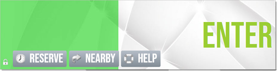
Button icons and Check-in button
You may use your own icons and control the look of the check-in button, which changes its look in three phases.
Check-in button text changes color using the following CSS. The icon may be changed too, as explained below.
#checkin {

	font-weight: bold;

}

.meet-before span{

	color: #3dba43;

}

.meet-during span{

	color: #ffcb00;

}

.meet-urgent span{

	color: red;

}

#secsToEnd {

	color: white;

}
Button icons are simple to change. For consistency we have separated sizes in a single definition while the actual graphics are listed individually for each button type. If you wish to use base 64 data-URI you may do so. This eliminates the need to use graphic files and improves performance. Use this tool to convert your graphics files to base 64 data-URI and embed these in your CSS: https://websemantics.uk/tools/image-to-data-uri-converter/
.img_clock, .img_lock, .img_lockopen, .img_srverror, .img_forward, .img_suspend,

.img_mphone, .img_globe, .img_checkin, .img_help {

    display:block;

    width: 24px; height:24px;

    background-repeat:no-repeat;

    vertical-align:text-bottom;

    margin-left: 10px;

}

.img_clock {

    background-image: url('../img/clock.png');

}

.img_lock {

    background-image: url('../img/lock.png')

}

.img_lockopen {

    background-image: url('../img/lock_open.png')

}

.img_srverror {

    background-image: url('../img/server_error.png')

}

.img_forward {

    background-image: url('../img/forward.png')

}

.img_suspend {

    background-image: url('../img/suspend.png')

}

.img_mphone {

    background-image: url('../img/mphone.png')

}

.img_globe {

    background-image: url('../img/globe.png')

}

.img_checkin {

    background-image: url('../img/checkin.png')

}

.img_help {

    background-image: url('../img/help.png')

}
Button Sizes
If you find buttons to be too small, you can change this easily. Use the code below to achieve this.
This code work on the whole class "doorBut". You may also apply the same rules on specific buttons only, for example the registration button....
For example, the code below will have the following effect:
.doorBut span {

  	font-size: 5.5vh;		/* increases the font size */

	background-size: 40px;	/* changes the size of the icons */

	margin-right: 5px;

	margin-left: 10px;

}


#meetProc, #actionButtons, #nfcEnrollDiv, #nfcEnrollDivCluster {

	height: 9.7vh;

}